 Domain SearchInstantly check and register your preferred domain name
 Web Hosting
 cPanel HostingHosting powered by cPanel (Most user friendly)
 WordPress HostingHost your WordPress website with fast, secure, and affordable WordPress hosting in Kenya.
 KE Domains
 Reseller HostingStart your own hosting business without tech hustles
 Windows HostingOptimized for Windows-based applications and sites.
 Free Domain
 Affiliate ProgramEarn commissions by referring customers to our platforms
 Free HostingTest our SSD Hosting for free, for life (1GB storage)
 Domain TransferMove your domain to us with zero downtime and full control
 All DomainsBrowse and register domain extensions from around the world
 .Com Domain
 WhoisLook up domain ownership, expiry dates, and registrar information
 VPS Hosting
 Managed VPSNon techy? Opt for fully managed VPS server
 Dedicated ServersEnjoy unmatched power and control with your own physical server.
 Website Builder
 Online Store BuilderLaunch a professional e-commerce store without writing code.
 Web Design ServiceGet a custom-designed website tailored to your brand and goals. From just KES 15,600
 BlogRead our guides on web hosting, online business, digital marketing, and more
 SupportOur support guides cover everything you need to know about our services
 ContactContact us via chat or email
WordPress 7.1 gives you more control over a page without leaving the block editor: different styles for smaller screens, button interaction states, native Tabs and Playlist blocks, a redesigned image editor, and richer Notes.
Some results were already possible in 7.0. The useful question is which tasks now take a different route.
Consider a recording studio’s website. Visitors need to hear samples, read the introduction on a phone, compare recording and editing services, and find the next step. The person maintaining that page needs to crop a photograph and resolve feedback before publishing.
I worked through those tasks in WordPress Playground, comparing WordPress 7.0.6 with 7.1.2 using the Twenty Twenty-Five theme and no active plugins. The fictional example, Harbor Sound Studio, gives each feature a job.
You can follow the same steps on a draft page with two audio files and a landscape image in your Media Library.
Let visitors hear two samples with the Playlist block
Start with the studio’s most useful evidence: something a visitor can play. Two audio samples also make the difference between the versions easy to see.
WordPress 7.0 already plays playlists. Its long-standing playlist shortcode accepts media attachment IDs. In my 7.0 page, a Shortcode block containing produced a player with both six-second samples.
Those numbers identify my files; your site’s IDs will differ.
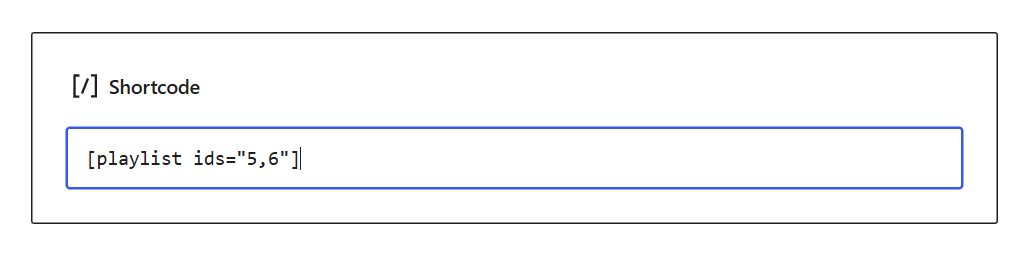
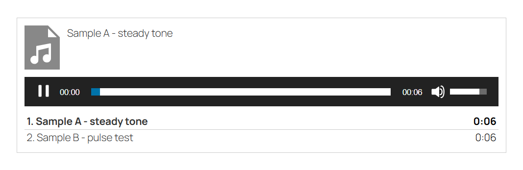
After saving the draft and opening its preview, I pressed Play. The timer advanced and the player offered both tracks. If your existing site uses this method, the new release does not make its audio obsolete.
Build the same section in 7.1
Open your draft in the editor, then:
Open the Block Inserter, search for Playlist, and insert the block.
Choose Media Library, select your two audio files, and click Select. The empty block becomes a player with a track list.
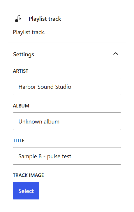
Select a track. In its Playlist track settings, enter an Artist name. I used “Harbor Sound Studio” for both samples.
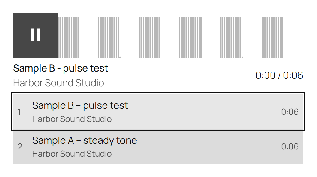
Select the track you want first and use Move up in its block toolbar. I moved “Sample B – pulse test” above “Sample A – steady tone.”
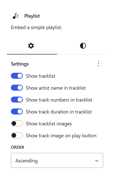
Select the parent Playlist using the breadcrumb at the bottom of the editor. Its settings control the list as a whole. I kept track names, artist names, numbers and durations visible, and turned off track images because these samples had no cover artwork.
Click Save draft, open the page preview, and play each track. Check the order and labels as well as the Play button. My preview retained Sample B first, displayed the studio name, and advanced through the six-second track. Switching samples also changed the waveform: a steady tone and a pulsed tone gave visibly different shapes.
For a studio portfolio, this means you can arrange a listening sequence while editing the page. You no longer need to manage this section through a string of attachment IDs. Keep an existing shortcode if it already meets your needs; choose the native block when you want to maintain the tracks visually.
Keep a large desktop heading without crowding a phone
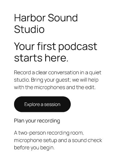
With the audio section working, turn to the introduction. I gave “Your first podcast starts here” a 64 px font size. That size suits a wide page, but it consumes too much space on a phone.
In 7.0, switching the editor to Mobile changes the preview width. It does not give an ordinary font-size edit a mobile-only scope. I changed the heading to 36 px there, returned to Desktop, and found 36 px there too. A theme, custom CSS or a page builder could already provide responsive typography; this particular editor control still changed the shared value.
In 7.1, you can turn on Responsive styles before making the smaller-screen adjustment:
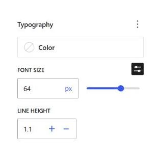
Select the Heading block and set its desktop font size to 64 px.
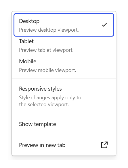
Open View in the top toolbar and enable Responsive styles.
Choose Mobile. Check for the Mobile badge in the block settings before changing a value.
In the heading’s Typography controls, set the custom Font size to 36 px, then save. The Mobile badge matters: it tells you which version of the style you are editing.
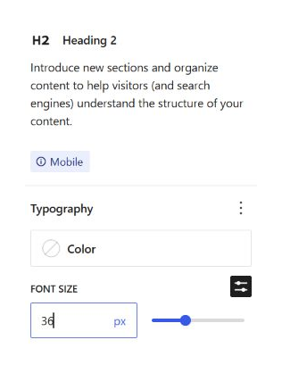
Switch back to Desktop and check the same heading. Mine still showed 64 px. I then checked the page preview itself: the browser applied 36 px at a 390 px viewport and 64 px at a 1440 px viewport.
WordPress uses the default style as the base. A mobile override changes only the properties you set for that range; it does not create a separate page. The default responsive breakpoints cover Mobile through 480 px and Tablet above 480 px through 782 px. Themes can change those widths, and a site can disable responsive style editing.
Use this control for the element causing the problem. Here, the heading needed less space; shrinking every paragraph would have made the page harder to read.
Show when the session button has hover or keyboard focus
The studio’s Explore a session button starts with a near-black background. A visible change on interaction helps a visitor recognize which control they are about to use.
In 7.0, my Button inspector offered ordinary styling controls but no state selector. Hover and focus styling still existed through CSS and theme rules. WordPress 7.1 brings those choices into the block inspector for supported blocks.
Select the individual Button, open its state menu, and choose Hover. The menu also includes Focus, Focus-visible and Active.
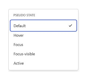
For this example, I set the Hover Background color to #00594F, a dark green. I then chose Focus-visible and set its background to #563B85, a dark purple. The default background remained #111111.
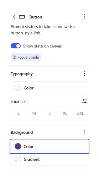
Save the draft and test the button on the page preview. Moving the pointer onto mine produced the green background. Moving the pointer away and navigating to it with Tab produced the purple background and a visible outline.
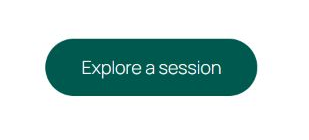
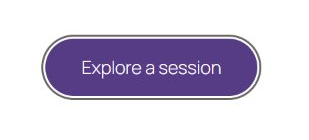
The editor’s Show state on canvas preview helps you choose a color, but the front-end check confirms the actual interaction. Give keyboard users a visible state too; a hover-only change helps someone using a pointer and does nothing for a person tabbing through the page.
WordPress documents these style states for Button and Navigation Link blocks.
Give Recording and Editing their own panels
The visitor can now read the introduction and recognize the session button. Next, help them distinguish two services without repeating the same headings throughout the page.
In my clean 7.0 installation, the inserter had no core Tabs block. You could use ordinary headings to show both services at once, or obtain tabs through another implementation. WordPress 7.1 supplies a native Tabs block.
Open the Block Inserter, search for Tabs, and insert it. Name the first tab Recording. Add its description inside that tab’s content panel:
Book the room for a two-person conversation. Your session includes microphone setup and a sound check.
Select the tab list and use Add tab to create Editing. Put its description inside the second panel:
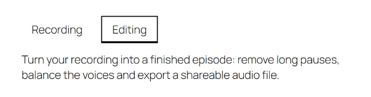
Turn your recording into a finished episode: remove long pauses, balance the voices and export a shareable audio file.
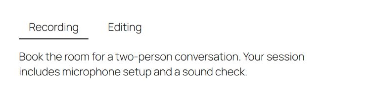
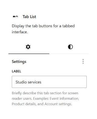
While you have the Tab List selected, open its Settings and give Label a useful description. I entered Studio services. This field describes the tab section for screen-reader users; it does not replace the visible Recording and Editing labels.
Save the draft and open its preview. Select Recording, then Editing, checking that each selection shows the corresponding paragraph. My Editing tab displayed the finished-episode description after the switch.
Tabs suit related alternatives that visitors can inspect one at a time. If someone needs to compare both services line by line, two visible sections may still be easier. Adding the core block also does not convert an existing plugin’s tabs automatically; check the old content before deciding to remove that plugin.
Crop the studio image and finish its description in one place
A room image helps explain the setting, but a wide photograph can dominate a compact service section. I started with a 1536 × 1024 image and wanted a square crop.
Cropping is not new in 7.1. In 7.0, I selected the Image block, opened its inline crop controls, chose a square aspect ratio and clicked Apply. The operation produced an edited image. What changes in 7.1 is the dedicated media-editing dialog and the nearby details workflow.
To follow the 7.1 route:
Insert an Image block, choose Media Library, and select your landscape image.
Select the image and choose Crop from its toolbar. WordPress opens Edit media.
In the Crop tab, set Aspect ratio to Square – 1:1.
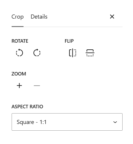
Before saving, switch to Details. For the example image, I entered “Microphone and headphones on a recording desk” as the alt text and “A quiet place to record your next conversation” as the caption.
These fields have different jobs. Alt text describes the relevant image content for someone who cannot see it. The visible caption connects the image to the page’s story. You do not need to repeat the same sentence in both.
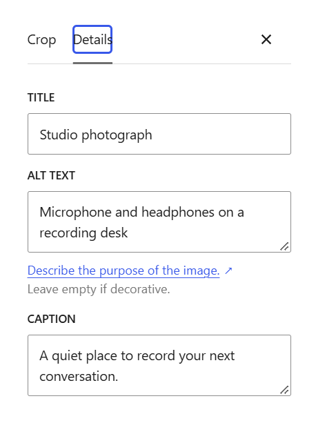
Click Save in the dialog, then save the page. Reopen the image editor to check the result. Mine showed studio-photo-edited.jpg at 1024 × 1024. The alt text and caption also remained, and the page preview displayed the caption beneath the image.
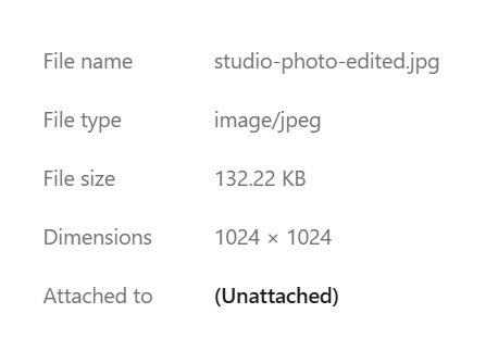
The practical gain is finishing the visual and its accompanying information during the same visit to the image editor.
Resolve the missing detail before publishing
The page now describes the room and services, but its introduction leaves one obvious question unanswered: how long is a session?
WordPress 7.0 already let me add a note to a paragraph. In 7.1, richer formatting and feedback attached to selected text make that review more precise. I selected the word Record in the introduction, opened the block toolbar’s Options, and chose Add note.
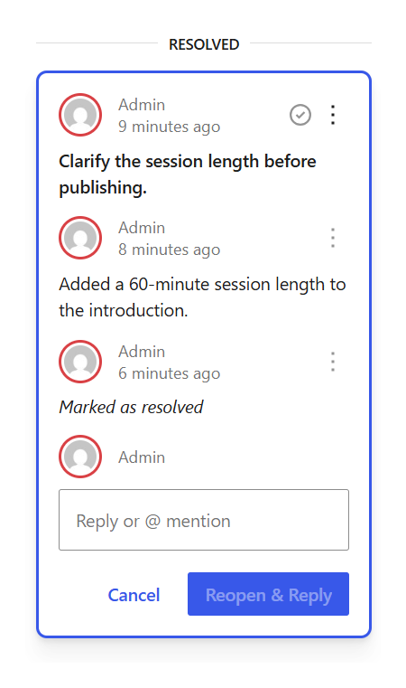
In the note, I typed “Clarify the session length before publishing,” selected that sentence and applied bold with Ctrl+B, then clicked Add note. That leaves a specific request attached to the text instead of a general reminder elsewhere.
To finish the review, I added “Each session lasts 60 minutes” to the paragraph and saved the draft.

In the Notes thread, I added the reply “Added a 60-minute session length to the introduction,” clicked Reply, and resolved the conversation. After saving and reopening the editor, the formatted request, reply and resolved status remained.
WordPress also documents mentions among the Notes improvements, but its 7.1 field guide places real-time collaborative editing outside this release. Do not plan a simultaneous editing session on the assumption that richer Notes supplies shared live cursors.
The persistent toolbar also keeps admin navigation available inside the editor. In my 7.1 session, View Page took me to the front end and Edit Page brought me back, which made checking these changes less disruptive.
Other 7.1 changes to account for
The page-building steps above cover the changes I exercised. Two less visible areas deserve attention when you maintain a site or build extensions.
Media processing: WordPress documents browser-side processing using WebAssembly and libvips, with server-side fallback when the browser path cannot handle the job. This is separate from choosing a crop in the new dialog. I did not benchmark uploads or server resource use, so these editing results do not establish a speed improvement for your hosting account.
Editor integrations: The iframe changes extend the iframe-based editor to cases involving legacy meta boxes. If you maintain an editor extension, check its styles, scripts and controls in that environment. WordPress 7.1 also expands the Icon API, including registration and rendering interfaces; the Icon block itself already existed in 7.0. These are developer changes, not additional page-building steps I tested here.
Try the update against the work your site actually does
For this studio page, 7.1 removes several reasons to leave the native editor: the Playlist block replaces attachment-ID editing, responsive styles separate the phone heading from the desktop heading, and Tabs provides a built-in home for the two service descriptions. Image editing and Notes make existing tasks easier to finish.
Your upgrade check should follow your page’s real purpose. On a copy of the site, confirm that the heading still fits at different widths, the button works with a pointer and keyboard, each tab opens its content, audio plays after saving, and the edited image keeps its description. If your site also takes bookings or payments, complete those separate tests before updating the live copy.
If you manage the site through cPanel, our staging guide walks through creating a copy for this work. Keep the existing theme and plugins in that copy: a clean Playground comparison explains the core changes, while your own site reveals which of them fit your setup.